

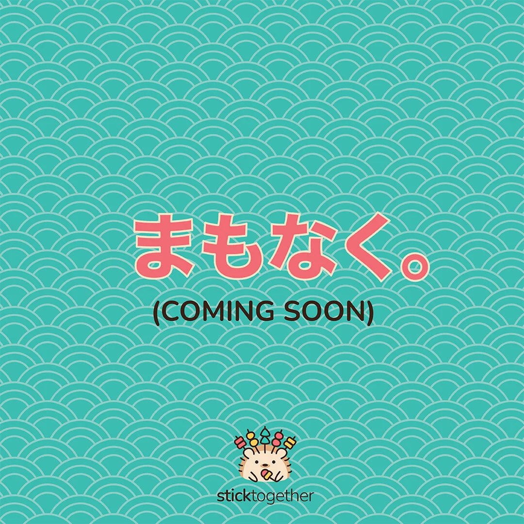
StickTogether
Brand Identity
2020
Role: Visual Designer @ Design Insight

My first time eating amazing Lok Lok in Singapore
During my stint at Design Insight, I had the opportunity to design the branding visuals for StickTogether - a Lok Lok stall known for unconventional flavours like crispy abalone with ebiko and wanton quail egg. These are the guiding phrases:
Fun. Adorable. Something to smile about amidst the pandemic.
The Logo
Hedgehog / Octopus?
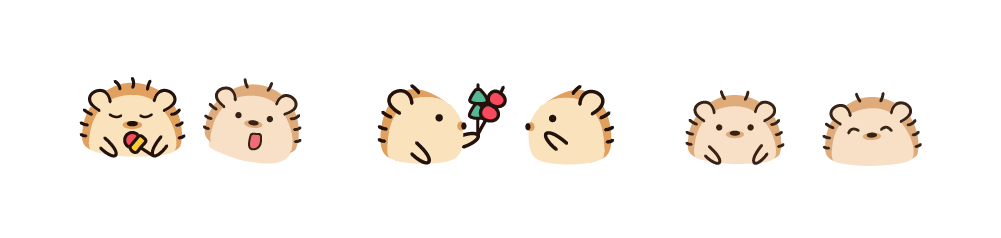
We thought about using a hedgehog as StickTogether’s adorable mascot, as the Lok Lok sticks could be placed on its spines. Alternatively, as the stall is located in front of a prominent octopus statue in Marine Parade, we also considered using the sea creature.

We eventually settled on the concept of a hedgehog as the link to Lok Lok was stronger. Various vibrant colour palettes and styles were explored:

Introducing … Pok Pok!

Stall Graphics
Signboard
A simple and eye-catching design that one can easily identify from afar - “The one with the hedgehog in front!”


Modular Menu
As the owners frequently concoct new items, we decided to make a modular menu board where the food, sauces and icon tags can be easily removed and moved around. These tags were printed out, cut and stuck with velcro.
(Food Photography: George Leung)


Posters
Whenever there are new food items or promotions, I ensure that they get the attention they deserve at the front of the stall.
(Photography: George Leung & Frozt)


Impact
“No more LOK-down, come StickTogether!”
Pok Pok appears on StickTogether’s social media twice a week, reminding viewers to wear a mask, sharing about the latest lobangs, and dropping teasers for upcoming food items. The following posts increased reach by over 200% and engagement by over 100%.

“The stall is located in a nondescript coffeeshop at Marine Parade Central but it was hard to miss their whimsical store sign ...”
Special thanks to:
Design Insight, StickTogether and George